JENNY BIRD · E-COMMERCE CASE STUDY

Designing and testing for conversion.

Four features I designed at JENNY BIRD, a Canadian direct-to-consumer jewellery brand with 400K+ monthly site visits, and the tests behind them.

I designed each feature, prepared the developer handoff and QA-tested it before launch, working with our digital product designer and the e-commerce, retention and development teams.

Role
Graphic & UX/UI Designer
Company
JENNY BIRD · Toronto, Canada
Timeline
2025–2026
Focus
Conversion, A/B testing, UX/UI
Tools
Figma, Shopify, Replo, Intelligems, Tolstoy
Cover — Designing for conversion · Shop the Look (960×400, 12.2s loop)

HOW EACH FEATURE CAME TOGETHER

  1. 01 →

    Discover

    UGC emails beat our standard campaigns, and customers kept asking which pieces a model wore.

  2. 02 →

    Design

    Templates and components built in our Figma design system, desktop and mobile.

  3. 03 →

    Handoff & QA

    Specs for our developer, then QA on desktop and mobile before every launch.

  4. 04

    Test & roll out

    A/B tested in Intelligems, with winners rolled out separately in Canada and the US.

Design · 01

Collection pages

Bringing customer content onto collection pages.

The problem
Our collection pages relied on product shots and promotional tiles — yet in email, UGC campaigns consistently outperformed our standard ones.
The solution
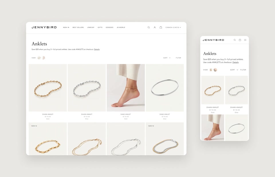
A UGC collection template, A/B tested on the anklets collection against our standard template with promotional tiles.
My role
Spotted the pattern in email, proposed the test, and designed the UGC templates for anklets and then sunglasses.
Motion / Feature 01 — UGC collection pages
+16%

Higher conversion in Canada

+29%

Higher conversion in the US

Relative lift in conversion rate from a 7-week A/B test on the anklets collection (Feb–Mar 2025, Intelligems). UGC won and was rolled out to other collection pages, starting with sunglasses. The standard template held a slight edge on order value in the US, so the next step was a hybrid that mixes UGC with product shots.

Timeline

Feb–Mar 2025 · 7-week A/B test, then rolled out to more collections

Jan 2025Jan 2026May 2026

Design · 02

Shop the Look

Shop every piece the model is wearing,
without leaving the page.

The problem
Customers kept reaching out through customer care and DMs to ask which pieces a model was wearing. Finding a full look on the site wasn’t seamless.
The solution
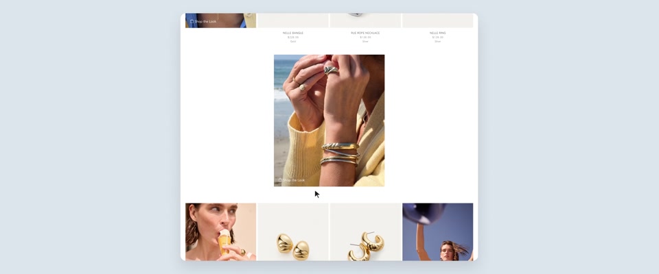
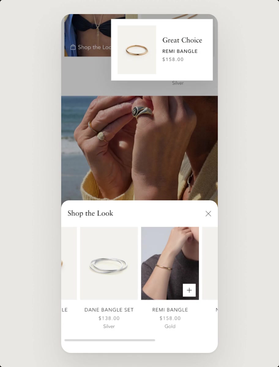
A Shop the Look drawer that lists every piece in the look, so shoppers can add them all without leaving the page.
My role
Researched established shop-the-look patterns in fashion retail, then adapted the best fit for JENNY BIRD, designing the desktop drawer and mobile bottom sheet.
Stage — motion A
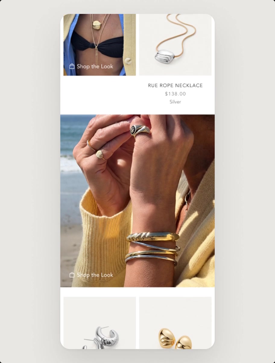
A

Browse

The collection on mobile.

Stage — motion B
B

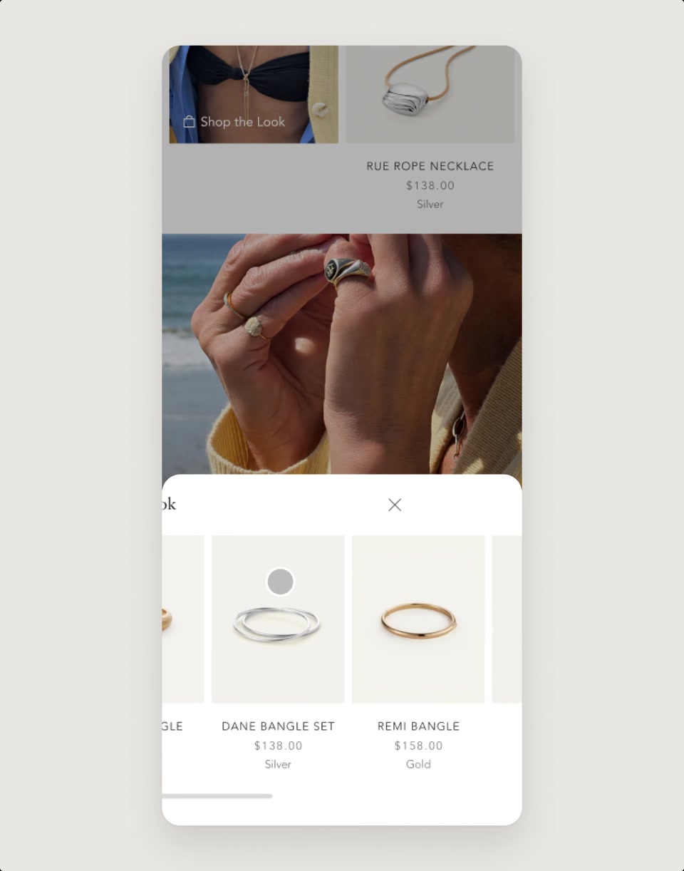
Shop the Look

The look opens as a bottom sheet listing every piece.

Stage — motion C
C

Quick add

Each piece can be added straight to the bag.

Outcome

After launch, Shop the Look was rolled out to two more collection pages and our lookbooks.

Timeline

May 2026 · launched

Jan 2025Jan 2026May 2026

Design · 03

Gift bags

Adding gift bags to the cart without cluttering checkout.

The problem
As JENNY BIRD added more gift bag colours and sizes, the single-product layout in the cart couldn’t hold the growing range — and we didn’t want to add steps before checkout.
The solution
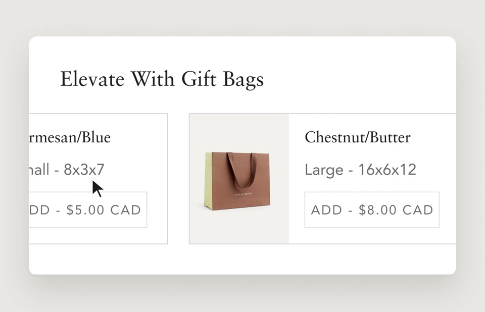
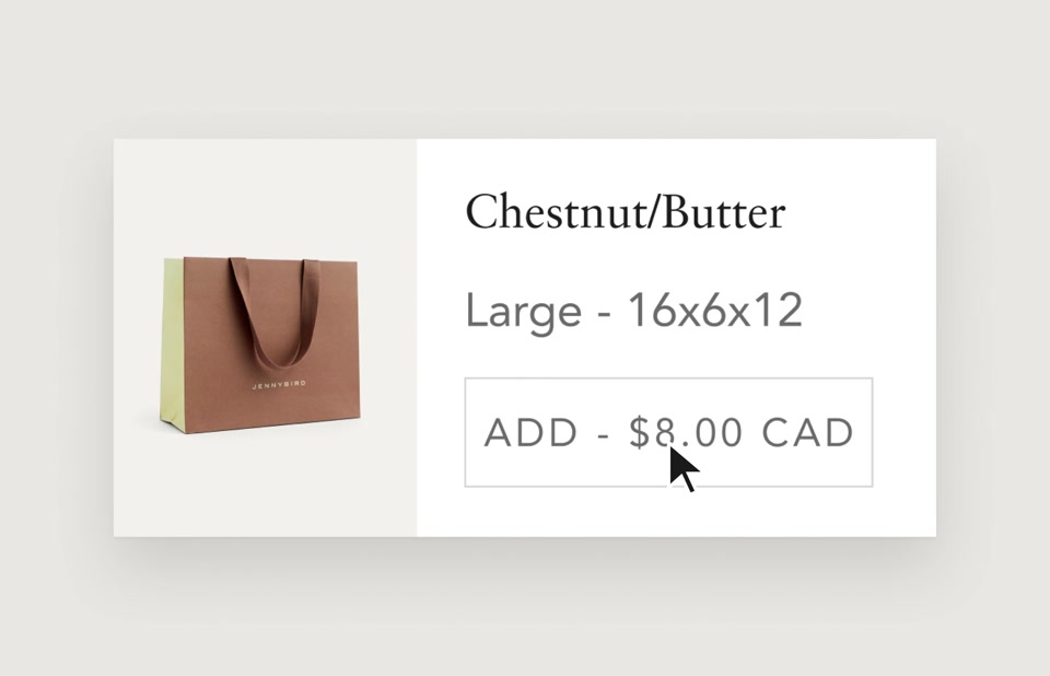
Compact, reusable product cards in the cart, each showing colour, size and price, with a one-tap Add button.
My role
Redesigned the gift bag area of the cart, replacing the single-product layout with modular cards that new bags could slot into.
Motion — Browse gift bags

01

Browse gift bags

Every bag gets its own card with colour, size and price.

Motion — Add in one tap

02

Add in one tap

One button adds the bag straight to the cart, with no dropdowns or extra steps.

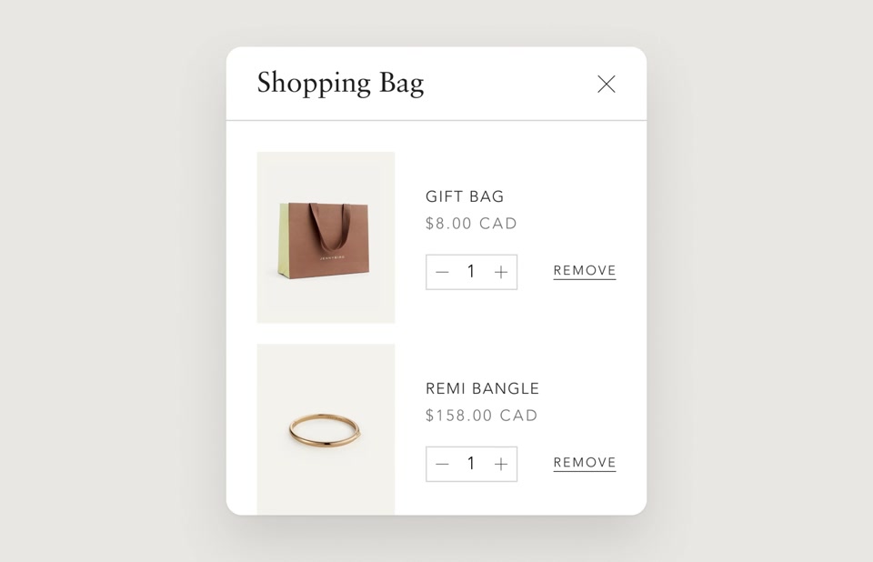
Motion — Bag updates

03

Bag updates

The gift bag appears as its own line item, so shoppers can see it was added before checking out.

Outcome

Launched for Holiday 2025 and still in use in 2026 — new gift bags were added without changing the layout.

Timeline

Oct 2025 · launched for Holiday 2025

Jan 2025Jan 2026May 2026

Design · 04

More styles & sizes

Keeping shoppers browsing within a product family.

The problem
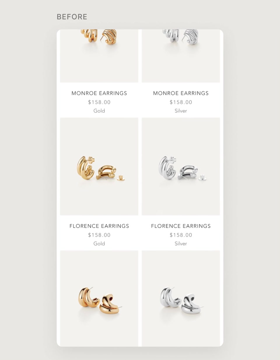
Many pieces belonged to product families, with different sizes or closely related styles. The product page only showed the piece the customer clicked, so finding another size or style meant going back to the collection.
The solution
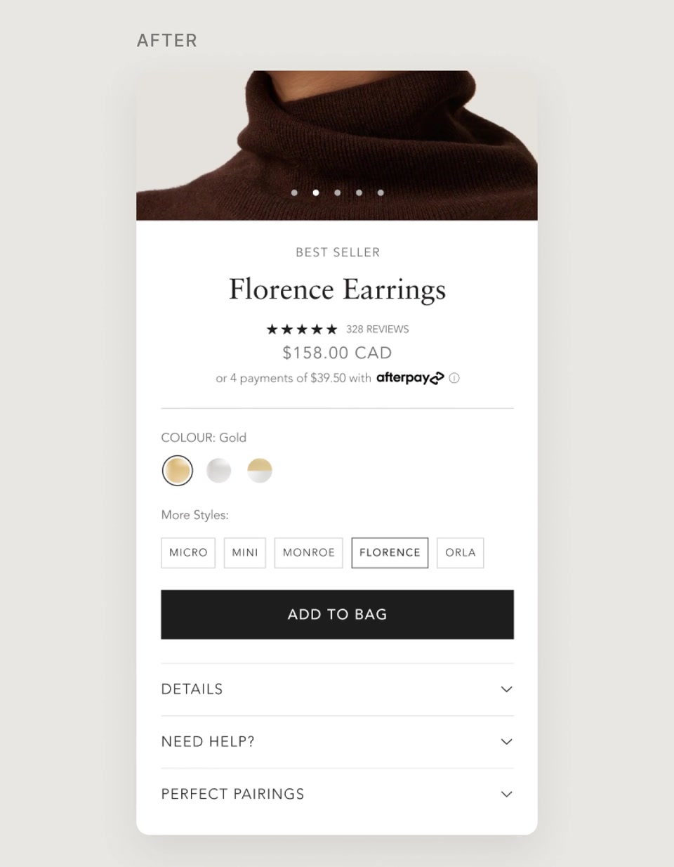
“More sizes” and “More styles” selectors on the product page that link every piece in the family, so shoppers can switch between them without leaving the page.
My role
Came up with the idea and designed the selectors for desktop and mobile to help shoppers discover related styles and sizes without navigating back.
Before — More styles & sizes · collection → Florence → swipe → scroll (no selector) → back → keep scrolling (420×540, 15s)
After — More styles & sizes · PDP → Monroe → swipe (420×540, 15s)

Outcome

Launched across every product family at once, on desktop and mobile.

Timeline

Summer 2025 · launched across all product families

Jan 2025Jan 2026May 2026

Testing

By market

Testing with the e-commerce team, market by market.

Beyond these features, I contributed to A/B tests the e-commerce team ran in Intelligems, working alongside our digital product designer. One pattern kept coming up: Canadian and US shoppers often responded differently, so the right answer was sometimes two answers.

PRODUCT PAGE VIDEOS · APR–AUG 2025

Carousel vs. pop-up bubble

Founder videos already lifted conversion on product pages. We tested two placements to find where they worked best: in the image carousel, or in a Tolstoy pop-up bubble.

Canada
+4% with the pop-up — rolled out
US
About even — carousel kept

48-HOUR SALE TEMPLATE · OCT 2025

$ off vs. % off

Our 48-hour sale template showed discounts either as dollars off or as a percentage off. What we learned carried straight into our Black Friday template in November.

Canada
$ off won — about +12% conversion
US
% off won — about +11% conversion

Relative lift in conversion rate for the winning version in each market, from A/B tests run with Intelligems.

Takeaways

What I learned

Small, tested changes add up — when they start from real customer behaviour.

Customers tell you what to build. The UGC template and Shop the Look both started from behaviour we could already see — in email results and in messages to customer care.

Test, then roll out by market. Canadian and US shoppers often responded differently, so the right answer was sometimes two answers.

Keep it simple for everyone. With many older customers, new features had to feel familiar — one row in the cart, one panel for a whole look.

Get in touch

Have a role or project in mind?
I’d like to hear about it.